
We have received many questions recently surrounding the subject of what is responsive web design (RWB). So we decided to put this blog together to give you an overview.
The definition of responsive web design is directly related to the appearance of your design and the way the HTML has been coded.
It is simply a different web design approach, which aims to display your website so that it can be viewed on any device be it mobile, tablet or PC/laptop.
This approach delivers simpler navigation though your site, with a minimum of resizing, panning and scrolling.
For a developer this is based on “slicing” the images, and during the coding stage, there are some “parameters” given in the HTML which adapts your site layout to the viewing environment, by using fluid, proportion-based grids along with flexible images.
A very easy way to understand RWB design is to actually find a website that is built this way and then simulate the environment of each device on your PC/laptop.
Viewing it directly on your smart-phone is actually faster but if you don’t have one available when you’re reading this article then using a simulator gives you the various devices to view your site.
Below you will find a small tutorial, for both Firefox and Chrome (Personally I find the IE way a bit too complicated).
Google Chrome:
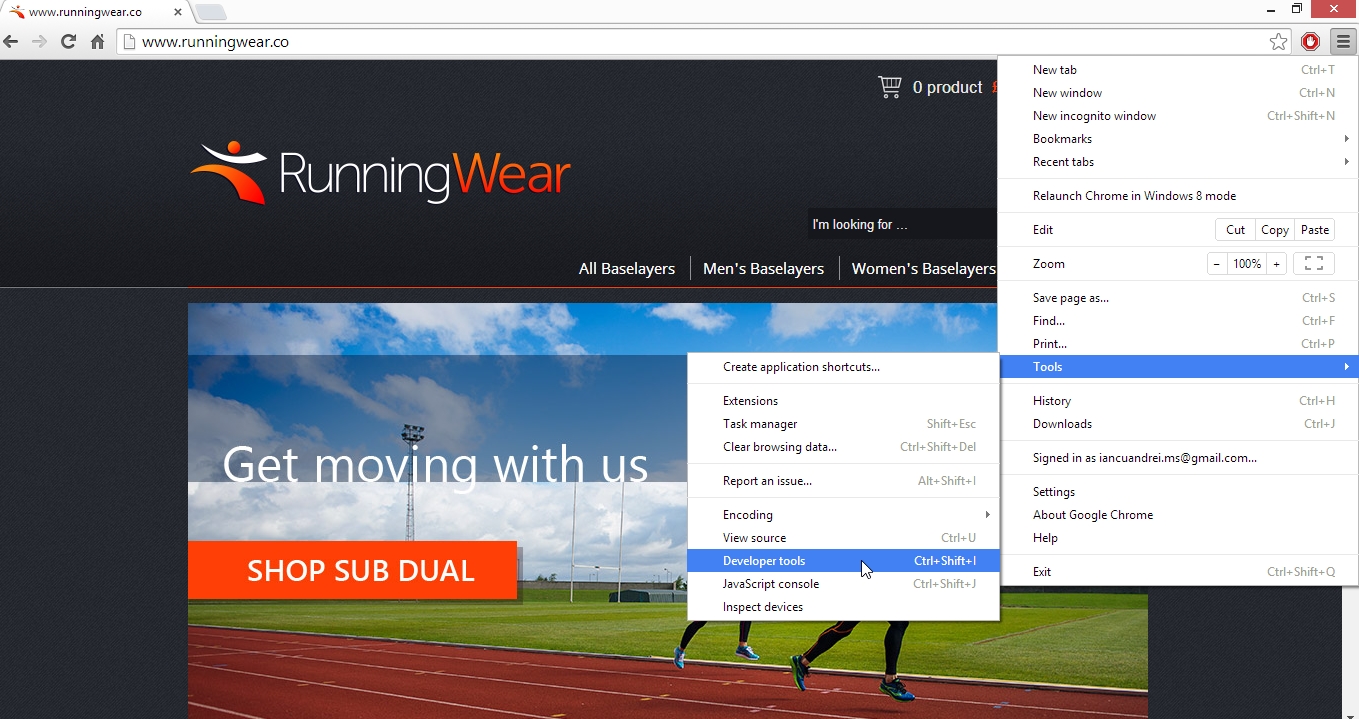
- Open Chrome and browse to the website you wish to view (I used this site we’ve just built: http://www.runningwear.co/ )
- Click the menu button on the top right-hand side and select tools > developer’s tools (ctrl + shift + i) or right click anywhere on the website and select “inspect element”.
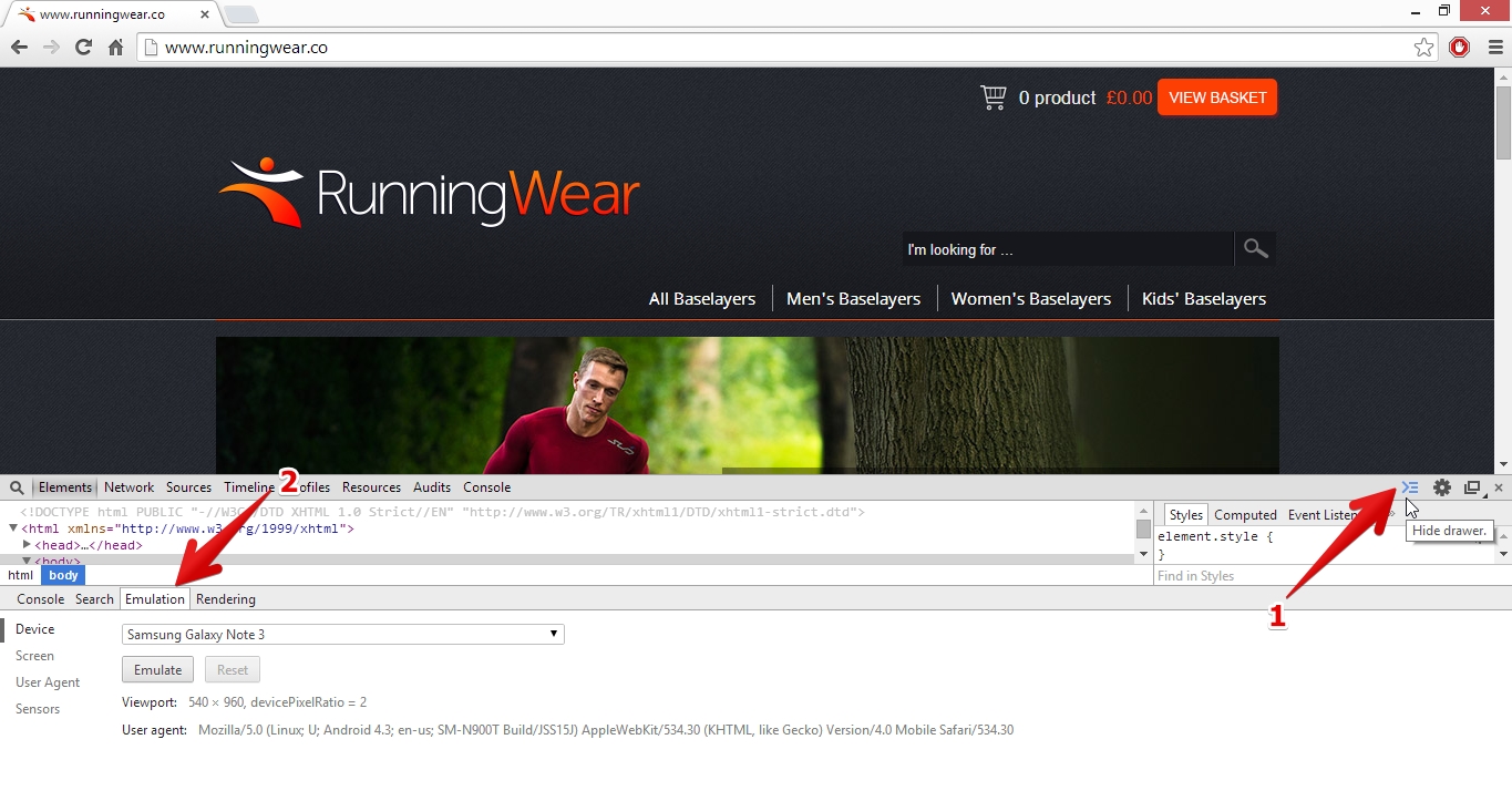
- This will display a screen at the bottom with the HTML from the background of this website. On the top of this new screen you may see a couple of other options, on the right. We need to open the drawer (if it isn’t open already).
- After you have opened the drawer (1), on the right hand side, navigate to the “emulation” tab (2) on the left.
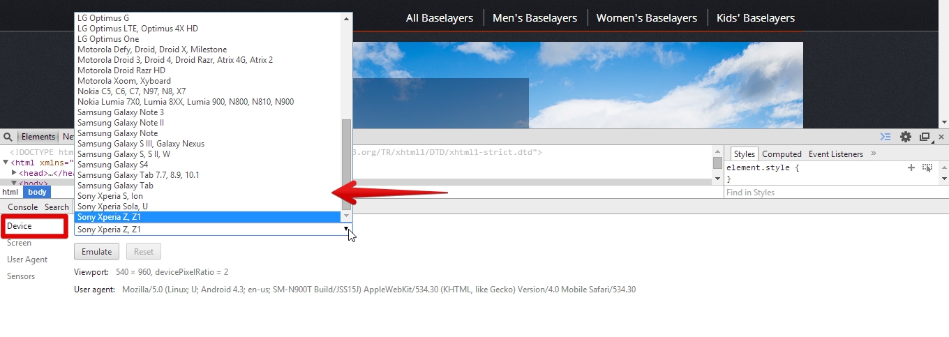
- Once you are here, you can click on the “device” drop-down and choose between a wide range of devices to emulate your site, and see how it “reacts” depending on the screen size is it viewed on.
You can do the same thing with Mozilla Firefox.
- Browse to the website you wish to view.
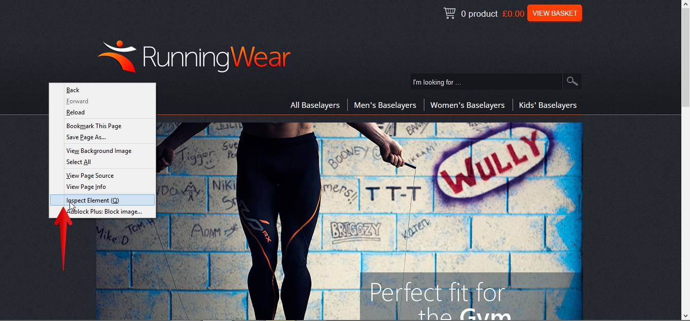
- Right-click anywhere on the site and select “inspect element”
- Once you see the developer console again, like in the above example for Chrome, click on the “responsive design mode” button on the right hand-side.
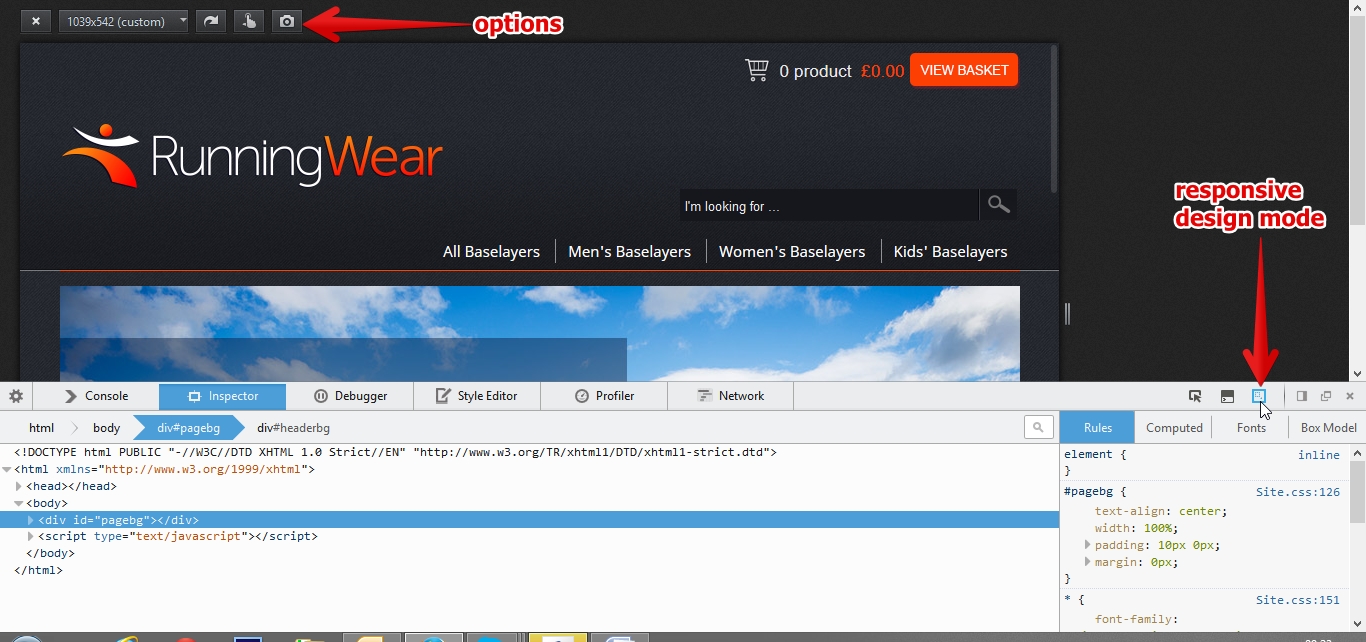
- You will see a set of options popping up on the top right hand-side corner of your browser screen. From this point on you can close the developer console as the responsive design mode will stay active until you have closed it (top left corner).
- In Firefox you don’t get a drop-down with a range of different devices but you do get some default screen sizes you can choose to view, and my favorite part is that you can drag the corners/sides to give it any custom size you want and you actually see in real time how it responds to different screen views/sizes while changing the size (see video below).
Below is a video showing the above actions on the two browsers:
As we have all seen in these past years, there has been quite a significant proliferation of mobile and tablet users worldwide. It is forecast that in 2014, consumers will spend approx. £ 45 billion on online shopping in the UK!
The main conclusion to be drawn from this is that the need for a responsive website is practically inevitable in the present and near future. Furthermore, many other sources have recommended responsive design as a cost-effective alternative to mobile applications.
If you found this article interesting feel free to look around our blog for more interesting information.
Should you need more details or are interested in getting your website responsive, give us a call and we can optimize your customers web experience.