The importance of regularly updating your website banners
Website banners, we don’t really think much of them. You have a couple of banners (maybe even rotating ones) on your website for a couple of years now, they should be fine, right? Wrong.
You can’t have the same banners forever! Especially not on your landing page. Think about it like this, the “above the fold” part of your website is extremely important, maybe the most important part of it.
Hold on, what does “Above the Fold” mean?
When we say “above the fold” we mean the part of a webpage that’s visible without having to scroll. Your website banner, header and navigation are the key ingredients making up what’s above the fold.
The saying originated in the newspaper industry, with “above the fold” meaning the upper half of a front page of a newspaper.
Why is it so important?
Even though people have a habit of scrolling down a webpage, they also have a very short attention span. That’s why what’s placed above the fold matters in terms of first impressions. And what’s the most striking thing in the above the fold section?
The banner.
…or banners. If you have customers that regularly come to your website and they keep seeing the same old banner for months or years, it’s a bad look. You need to have a fresh banner every few months or so.
First of all, the banners should be simple, elegant, eye-catching and they need to make the message clear from the start. First time visitors need to know what your website offers immediately.
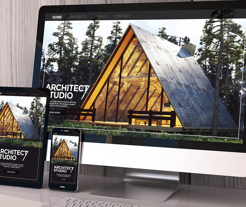
Second, you have to keep in mind that your website banner is the main imagery that takes top billing on your homepage. In web-speak, it can also be referred to as a hero image or billboard. Your homepage banner is the gatekeeper of your website, with a very important job. It needs to help the right visitors dive deeper into your website.
If you’re in the eCommerce world, you want people to place orders on your website. In that case, including a “Shop Now” button on your main banner is a no-brainer. This will attract visitors to click that button, and if they do, they should be taken to a page with the best products that you offer.
Bottom line: You only have a few seconds to communicate what you do. If you’re not clear, a visitor is going to click the back button and find someone else in the search results that immediately says what they want to see. (that’s called bouncing – and we want to avoid it at ALL costs).
How large should my banner be?
The size of your banner is going to determine what else you can fit above the fold. In other words, the bigger your billboard, the less other stuff people will be able to see on your homepage. It depends mostly on your preferences, but if you’re a company that offers a ton of different products or services, you might want to utilize a smaller banner so that you can tease a section below the banner that lists some of them.
What about rotating banners, are they any good?
In short – maybe. Rotating banners can be good, but they also have a few downsides. A rotating banner allows multiple pieces of content to exist in the same top-billed section of your website. In theory, this type of banner is great. You can communicate several messages, you can play with the design and you can feature your latest news — all in the top section of your homepage.
So what are the downsides?
- Well, first of all – loading time. Having more banners means the website will take longer to load, and we don’t want that.
- Second, your messaging gets jumbled and your main point gets lost. Saying six different things on individual banners isn’t really being clear, is it?
- People are sometimes impatient, they don’t wait around for all of your sliders. If they get bored, they’ll click away before the second or third banner even showed up. This is why the main (first) slider needs to be perfect.
So yes, rotating banners can be good, but only if used properly.
Promotional sales – use banners for them!
There’s no better way to let people know that you’re running a promotion than by using a banner. With Black Friday coming up in a few weeks, get a banner designed for it and put it on your website. This will let people immediately know that you’re running a Black Friday promotion, and they will be more likely to stay and browse your website/products.
Christmas coming up? Create a banner and add it to your website to replace the old banner that you’ve used for the rest of the year. Let your visitors know that you care about your website and that you update it every chance you get.
Give your website a fresh look by simply changing a banner or two – it is so simple!
Conclusion
To recap, keep the following tips in mind when you’re planning your homepage banner:
-Use an attractive, authentic
-Be clear, simple and straight to the point in your headline messaging
-Size does matter — especially if you want to tease a products/services section
-Use a rotating banner only if you have to! And if you really want to use rotating banners, use them correctly, as mentioned above.
This is your web-page, and the main banner will either make or break the deal. Don’t forget that!